Brand Strategy
KnoxSky Brand Identity System
Defining a complete brand identity for a Knoxville technology and marketing company — logo suite, typography, color, voice, and the governance standards that keep it consistent.
Overview
A brand is only as strong as its consistency. For KnoxSky — a Knoxville company offering IT, hosting, web design, and marketing services — I developed a full brand identity and the guidelines to govern it, giving a growing business a professional, ownable presence from day one.
Challenge
New companies often launch with a logo and little else, then watch their identity drift as more people create more materials. KnoxSky needed more than a mark: it needed a documented system — strategy, visual language, and rules — that anyone could apply and that would hold up as the company scaled.
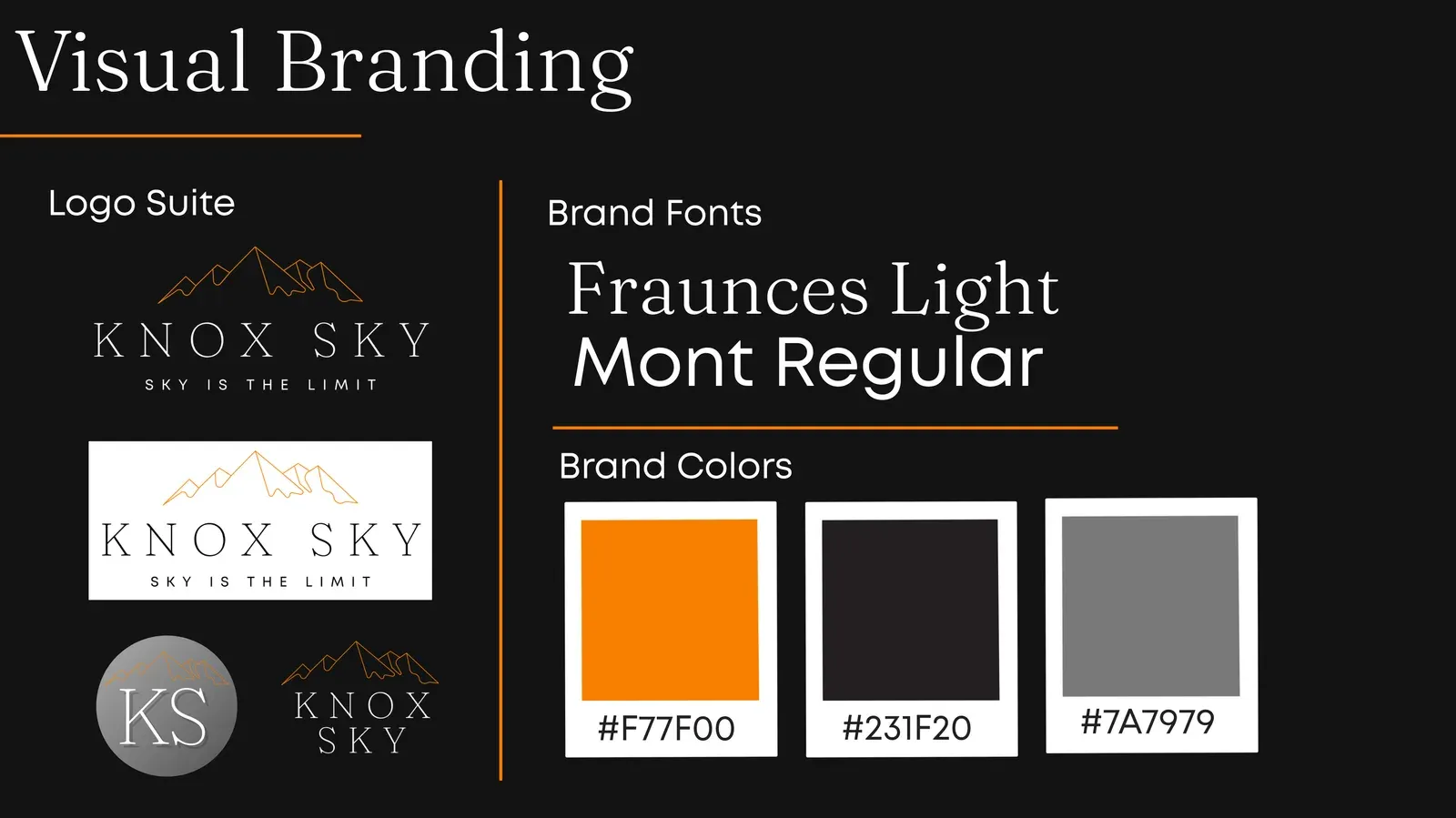
Strategy
I built the brand from positioning outward. Starting with the company’s story and “sky is the limit” ethos, I defined a visual identity — a logo suite, typographic system, and color palette — and codified it in a brand guide so application stays consistent across web, social, print, and client-facing work.
Execution
- Articulated the brand narrative and positioning that anchor the identity.
- Designed a flexible logo suite — primary, secondary, monogram, and stacked marks — for every context and size.
- Established the typographic system (Fraunces and Mont) and a disciplined color palette with defined values.
- Documented usage standards in a complete brand guide, turning the identity into a governable system rather than a one-off logo.
Impact
KnoxSky launched with a brand that looks established and stays consistent everywhere it appears. The brand guide is the single source of truth for the company’s identity — the same discipline I bring to protecting brand standards at an institutional scale.
The work